Archives
WPBakery Page Builder Settings
If you are building a site from scratch, we suggest you to apply the following WPBakery Page Builder settings (fig. 1):
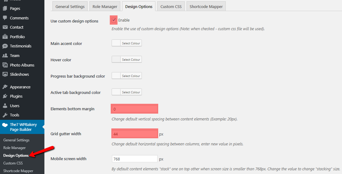
Fig. 1. WPBakery Page Builder Design settings.
If you are using pre-made demo web-site, appropriate settings are imported automatically. And you can skip this step.
Adding & Editing Posts
To create a post, navigate to “WP-admin > Posts > Add new”.
In addition to all standard stuffs like header options and widgetized areas management, Posts back-end interface has a box called “Post Options” (fig. 1):
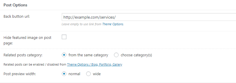
Fig. 1. Post options.
Here you can:
- specify a link for the “Back” button (more info is available here), different to the one pointed in Theme Options -> Post Types;
- hide featured image on a single post page (in other words, inside of an individual post);
- select categories for related posts (fig. 2):
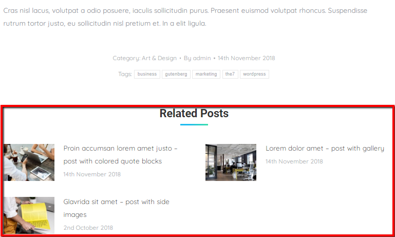
Fig. 2. Related posts.
- choose post preview width on a blog page: normal or wide (fig. 3):
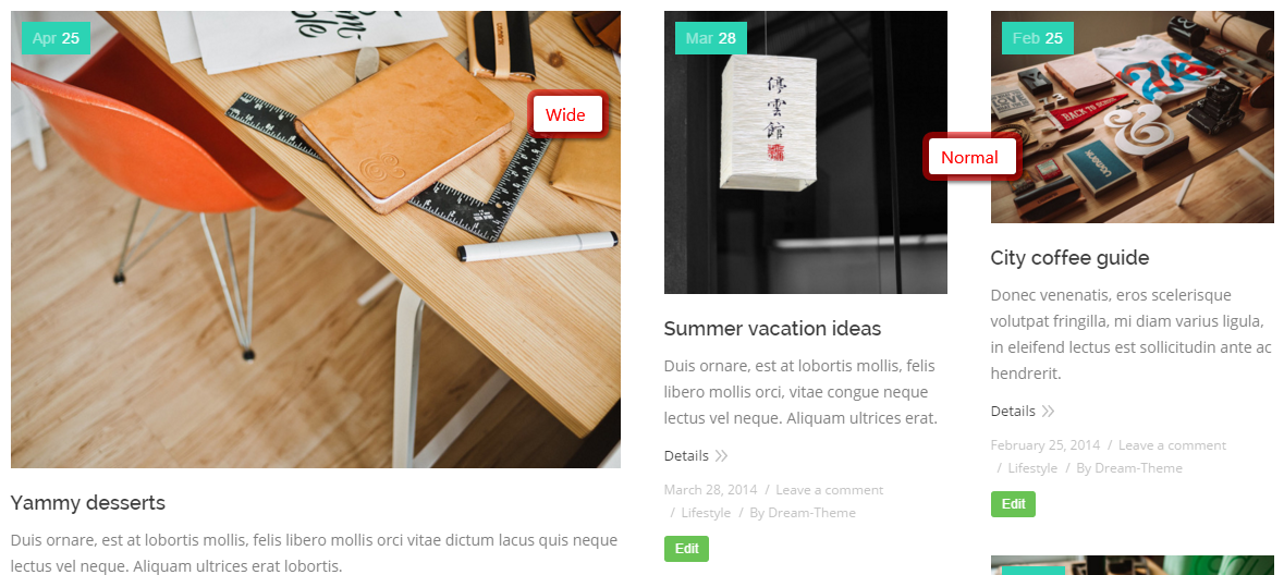
Fig. 3. Post preview width.
“About the Author” (fig. 4) information comes from Dashboard -> Users -> [open appropriate profile] (fig. 5).
For the author avatar you should be registered in the web-site (Dashboard -> Users -> Your profile) using the same email address, as at Gravatar.com.
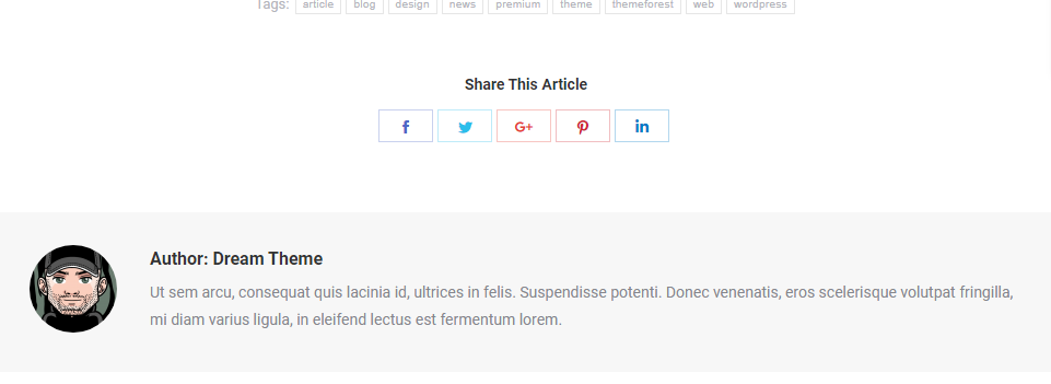
Fig. 4. Author info. Front-end.
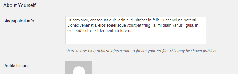
Fig. 5. Author info. Back-end.
Displaying Team
In order to display Team section on a page, you can use our super configurable WPBakery team shortcodes (fig. 1):
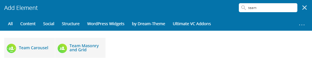
Fig. 1. Team shortcodes.
Team Masonry and Grid
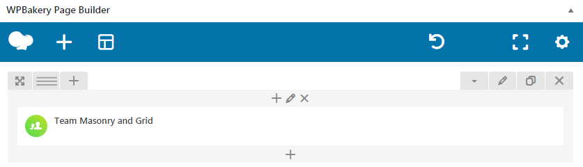
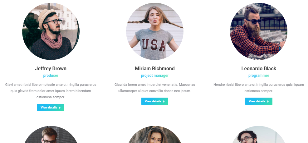
Fig. 2.1. Team Masonry & Grid shortcde.
First “General” box in shortcode settings offers to select which team members display (fig. 2.2).
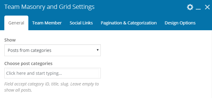
Fig. 2.2. Team Masonry & Grid settings.
You can select posts basing on their category or display all posts. Other settings from this tab allow to configure posts feed:
- Masonry or Grid mode;
- loading effect;
- background color and padding;
- image size, padding, animation, hover;
- columns settings, where you can specify number of columns depending on device and browser width;
- responsiveness (decide when to switch to a single-column layout).
In “Team Memeber” tab you can:
- configure content alignment;
- whether to display team member position and description;
- configure font style, size, color for team member name, position and description;
- set up “View Details” button.
You can apply required settings for contact info of a team member in the “Social Links” tab (fig. 2.3). Decide whether to display these icons at all, set their position and configure color / size options.
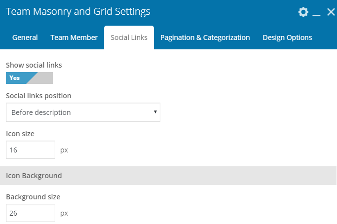
Fig. 2.3. Social Links tab.
It is possible to enable different modes of pagination and adjust the number of team memebrs to display in “Pagination & Categorization” tab. You can also configure category filter here: descending/ascending order, name/date ordering and look of filter buttons.
Team Carousel
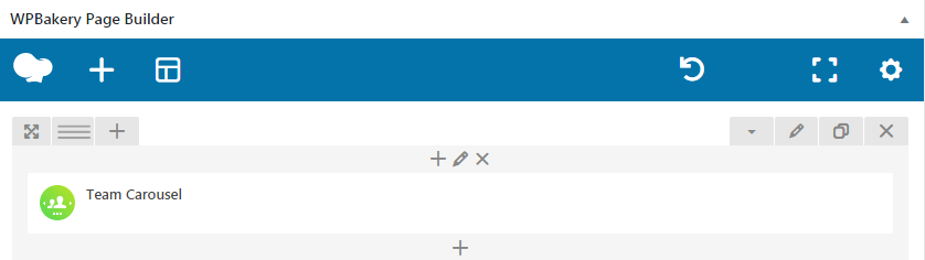
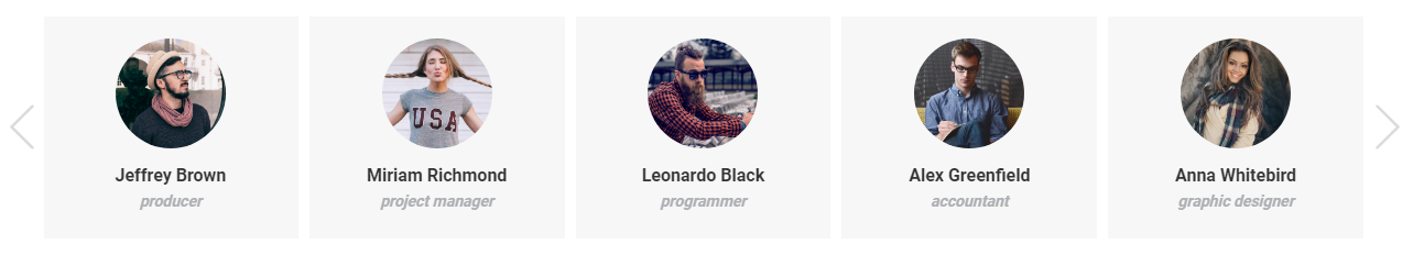
Fig. 3.1. Team Carousel shortcode.
Team Carousel has almost the same settings as Team Masonry & Grid, except options for scroll: whether to scroll one slide at time or all visible slides. Plus, settings for arrows (fig. 3.2) and bullets:
- disable/enable;
- select icon, its color, background and position.
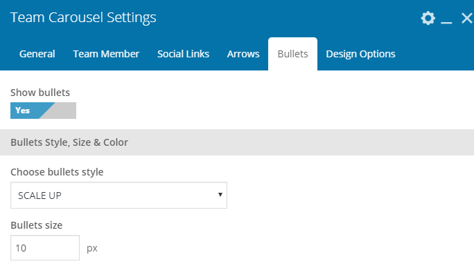
Fig. 3.2. Team Carousel settings.
Page Templates
In addition to WPBakery Team elements, you can also use “Team” page template (fig. 4). But please consider, it has less settings than the shortcodes described above.
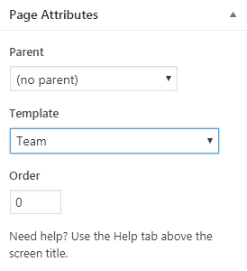
Fig. 4. Team page template.
Displaying Testimonials
In order to display Testimonials on a page, you can use our super configurable WPBakery testimonials shortcodes (fig. 1):
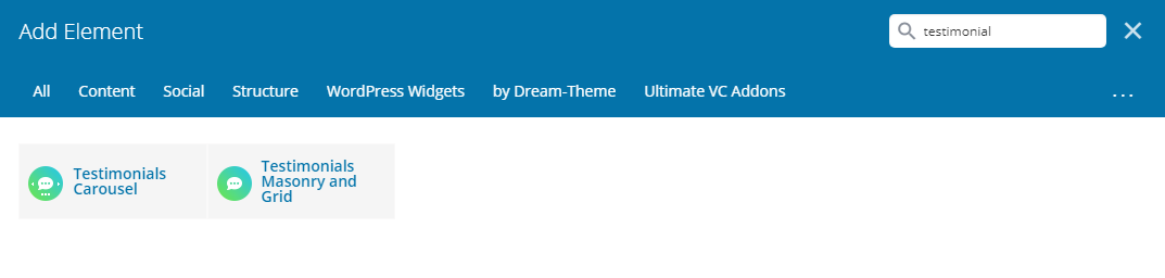
Fig. 1. Testimonial shortcodes.
Testimonials Masonry and Grid
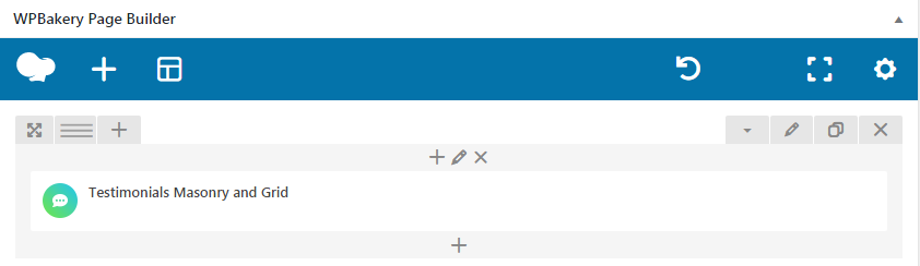
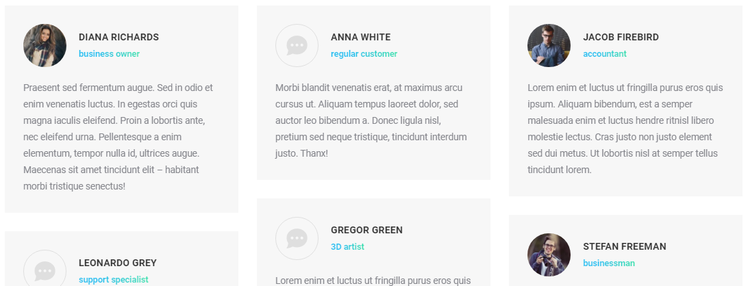
Fig. 2.1. Testimonials Masonry & Grid.
First “General” box in shortcode settings offers to select which posts to display (fig. 2.2).
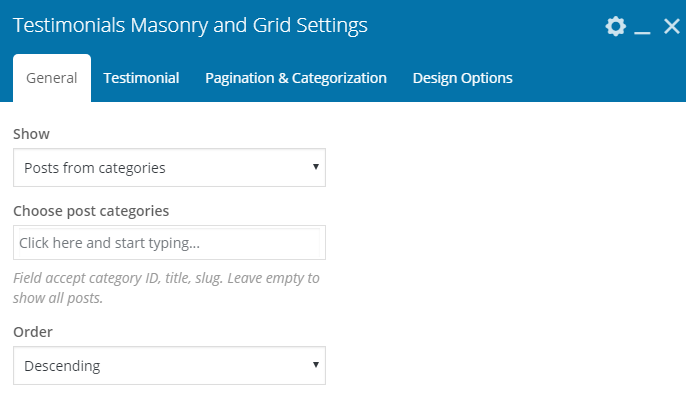
Fig. 2.2. Testimonials settings.
You can select posts basing on their category or display all posts. Other settings from this tab allow to configure posts feed:
- Masonry or Grid mode;
- loading effect;
- layout;
-
content alignment;
- background color and padding;
- image size, padding, animation, hover;
- columns settings, where you can specify number of columns depending on device and browser width;
- responsiveness (decide when to switch to a single-column layout).
In “Testimonial” tab you can decide whether to display author name and position, adjust their font style and colors. And whether to display the entire text of a testimonial or only an excerpt. This section also has settings for fonts styling.
It is possible to enable different modes of pagination and adjust the number of testimonials to display in “Pagination & Categorization” tab. You can also configure category filter here: descending/ascending order, name/date ordering and look of filter buttons.
Testimonials Carousel
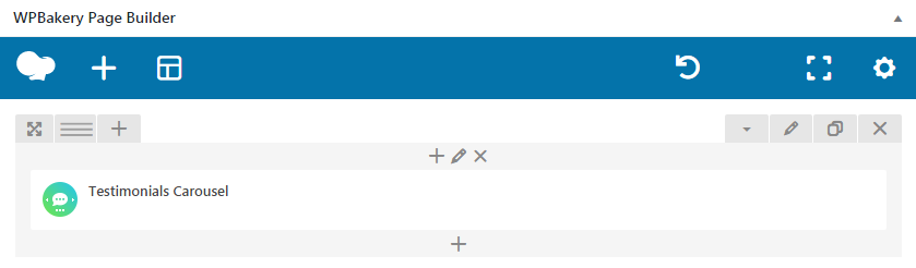
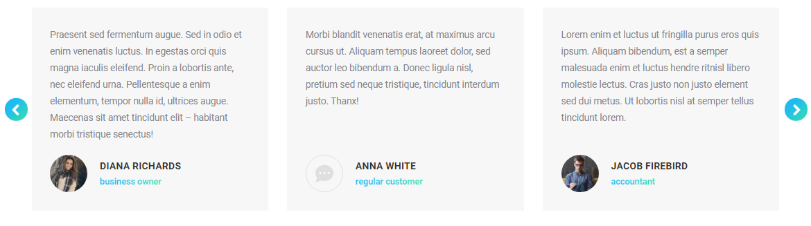
Fig. 3.1. Testimonials carousel.
Testimonials Carousel has almost the same settings as Testimonials Masonry & Grid, except options for scroll: whether to scroll one slide at time or all visible slides. Plus, settings for arrows (fig. 3.2) and bullets:
- disable/enable;
- select icon, its color, background and position.
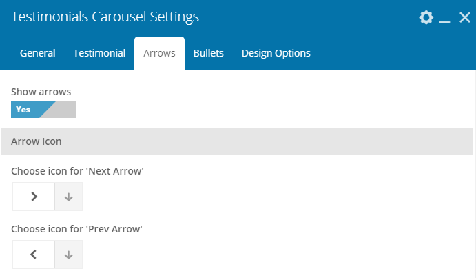
Fig. 3.2. Testimonials carousel settings.
Page Templates
In addition to WPBakery Testimonial elements, you can also use “Testimonials” page template (fig. 4). But please consider, it has less settings than the shortcodes described above.
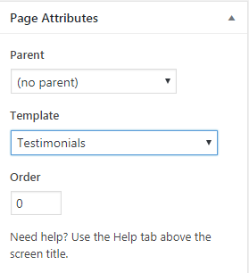
Fig. 4. Testimonials page template.
Branding
On this page you can upload logos for different locations at your site, specify padding for these logos, set up copyright information, etc.:
Note: Logos of different users comes in different size and ratio, so theme does not re size logos or do not prefer any specific size, you need to upload it in actual size you want to display in site.
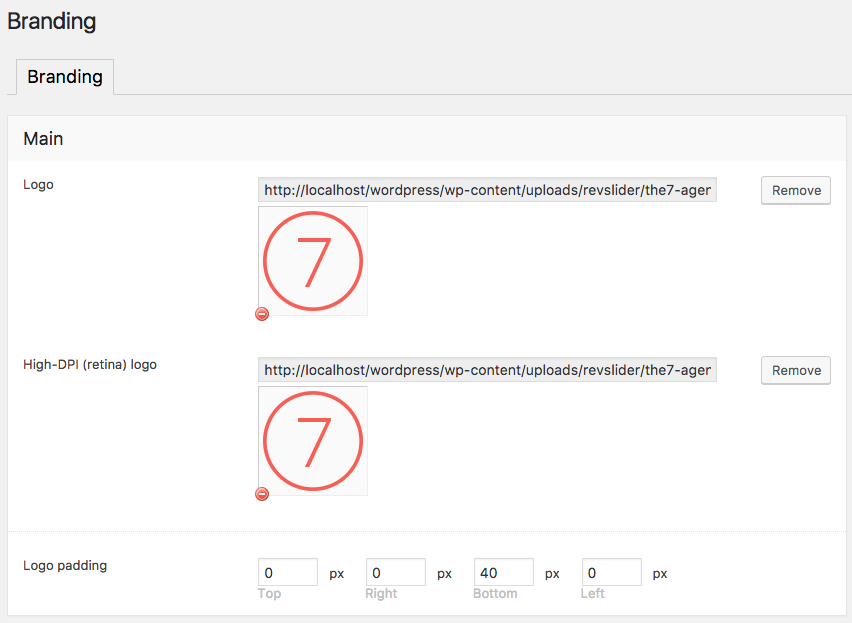
Fig. 1. Branding. Upload logos.
- Logo in Header: Upload logo for ordinary desktop devices and a high resolution logo for retina devices (fig. 1).
- Transparent header: Logo to display on pages using Transparent header.
- Floating navigation: Enable/disable and upload logo in floating menu (menu which appears on the top, when you scroll down the site).
- Mobile: Logo to display on mobile devices.
- Transparent mobile header: Logo to display on pages using Transparent header, on mobile devices.
- Bottom bar: Logo to display in the bottom bar of the site.
- Favicon: Upload favicon, please refer here if you’r not sure about what is a favicon.
- Icons for handled devices: these icons will be shown like an app icon when a user saves your web page to his home screen of devices like iphone, ipad etc.
- Enter copyright information (fig. 2).
- Enable/disable Dream-Theme credit in your bottom bar.
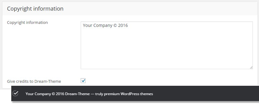
Fig. 2. Copy right & Credits.
Understanding Albums & Galleries
What’s the difference between Albums (“Photo/Video Albums” or just “Albums”) and Galleries (or just “Photos” in some themes).
If you’re a bit old-fashioned, in a physical world, your photos are still contained in the photo-albums. Same happens in the theme: each Album contains a set of media files: photos and videos.
You can display media files in 2 modes:
1. Albums – in this mode, you can see a set of Albums (fig. 1.1).
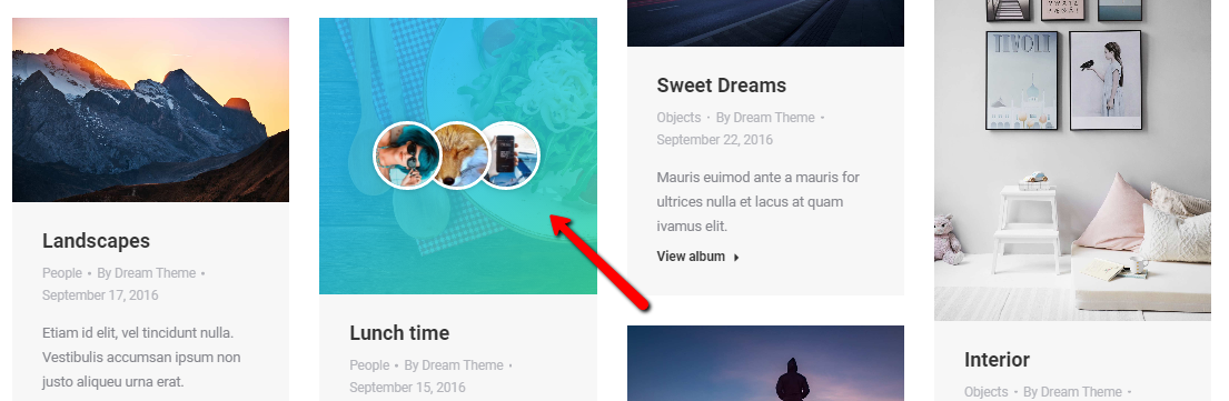
Fig. 1.1. Albums page.
Click on one of these albums will open it and reveal photos inside (fig. 1.2). This mode is sometimes also called the “2-level gallery”:
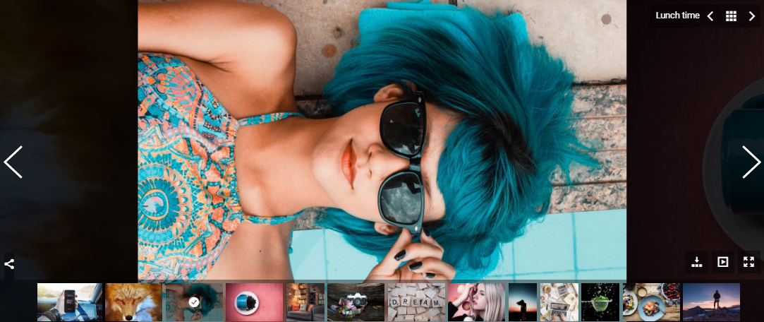
Fig. 1.2. Photos inside of an album.
2. Gallery – media files from one or couple of albums are being displayed on a page (fig. 2). Clicking on a media file thumbnail will activate it (photos will be enlarged, videos will start to play). This mode is also called the “flat/plain”, “1-level” or “classical” gallery:
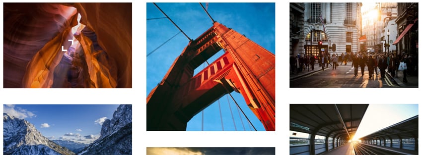
Fig. 2. Gallery – set of images displayed on a page.
Header Style
In every post/page back-end interface, you’ll notice “Page Header Options” box (fig. 1.1):
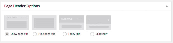
Fig. 1.1. Page header options.
Here you can choose page header style:
- “Show page title” option simply renders page title (and breadcrumbs, if enabled) the way it is configure in Theme Options -> Page Titles.
- “Hide page title” removes the title from a page.
- “Fancy header” allows to configure individual design of title area for the current page: background color or image, text color and size, etc. More details are available here.
- “Slideshow” option displays a slider instead of a page title. More info is available here.
Activating “Fancy header” or “Slideshow” option unveils additional “Header overlay” bunch of settings (fig. 1.2). You can choose between default and transparent modes (last one will not work for sites with sidebar-style headers).
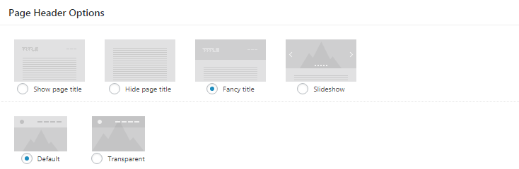
Fig. 1.2. Header overlay options.
If “Transparent” option is chosen, you get additional styling settings (fig. 1.3):
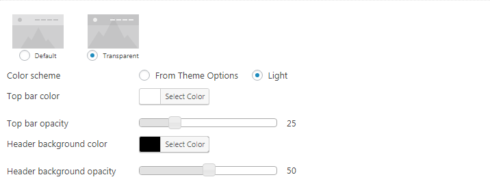
Fig. 1.3. Additional settings for Transparent header.
-
- “Light” color scheme – helpful when transparent header has dark background;
- topbar background color;
- header background color.
Slideshow
All slideshow settings are gathered inside the “Slideshow Options” box.
Note that in order to display a slideshow in page header, you’ll need to create at least one slideshow in corresponding post type:
- in “WP-admin > Slideshows” for Porthole and Photo scroller;
- in “WP-admin > Revolution Slider” for Slider Revolution.
When you select slideshow option in Default mode, you will get an option to place it above or below header (fig. 1).
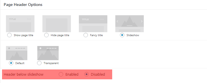
Fig. 1. Header below slideshow.
You can choose from the following slideshows:
Slider Revolution
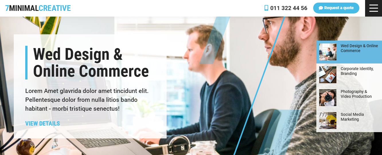
Fig. 2.1. Slider Revolution.
The7 is delivered together with extremely popular Slider Revolution plugin. Read on how to install it here. In Slideshow Options (fig. 2.2), you just need to select which slideshow to display and… that’s it.
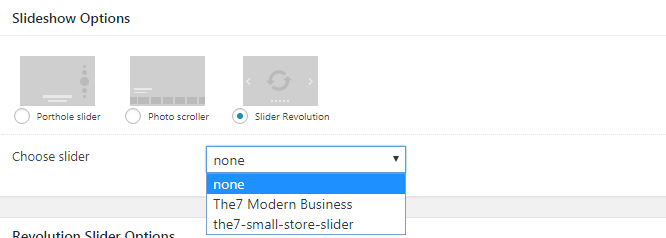
Fig. 2.2. Slider Revolution settings.
Porthole Slider
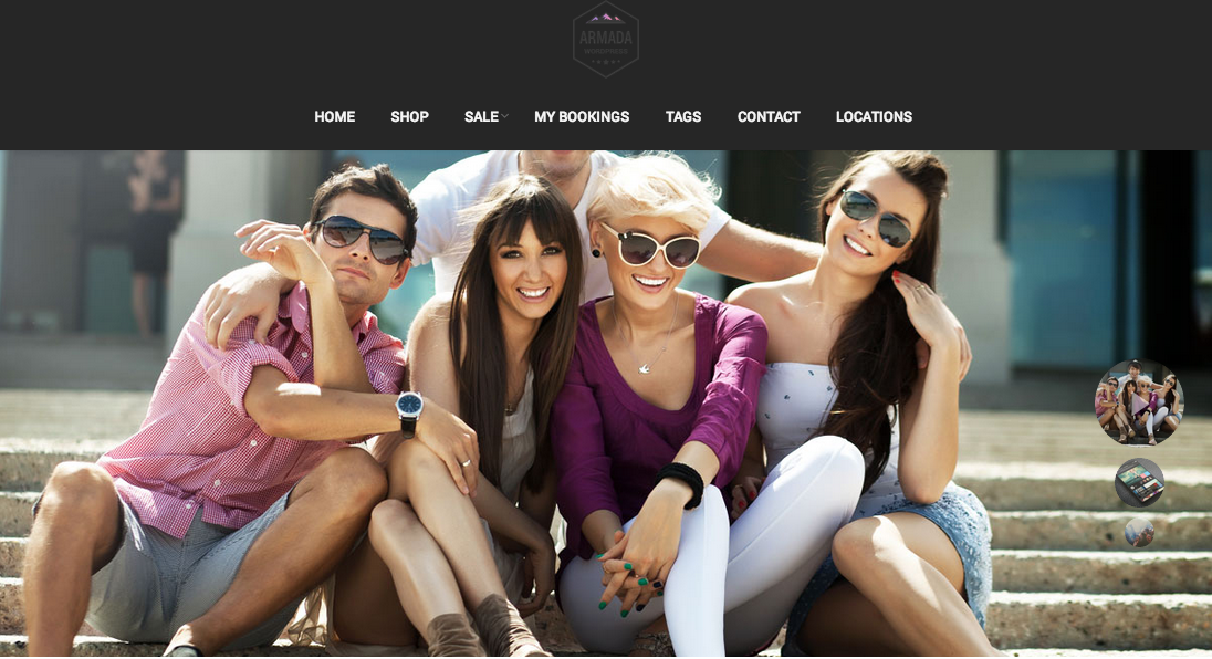
Fig. 3.1. Porthole slider.
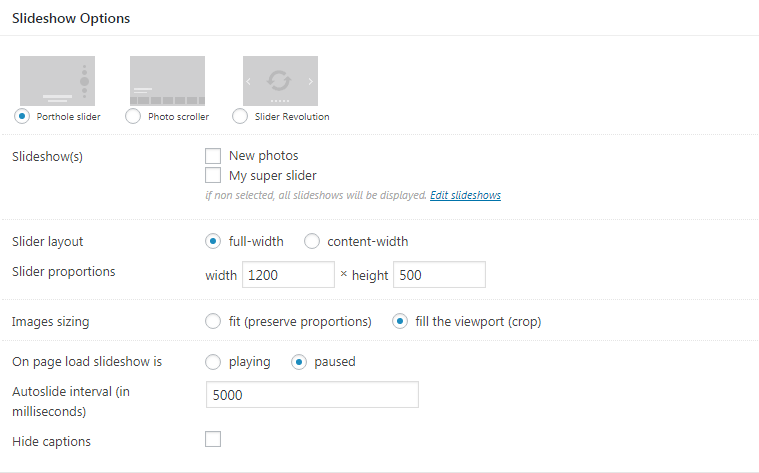
Fig. 3.2. Porthole slider options.
After choosing this type of slider, you will be presented with following options (see fig. 3.2) :
- In the multi-select (or checkbox group) box called “Slideshow(s)” you can specify which slideshows from corresponding post type will be shown on this page. Note that if you do not select any slideshow, all of them will be displayed on this page.
- Slider layout: full-width (will be huge on “non-boxed” sites) or content width.
- Set slider layout and its proportions. Note that since theme is responsive and has no fixed width, you need to specify slider proportions rather than absolute values.
- Select image sizing. This feature is important if you have portrait images and do not want them to be cropped. Simply select the “fit” option. Otherwise select “fill” to make every image fill entire slider area.
- Also you can enable slider autoplay and set its interval.
- Hide slider captions.
Photo Scroller
Settings for this slider are very complicated (see fig. 4.2). However, it allows you to craft slider layout carefully and make showy “slider-gallery” type pages. We highly recommend this slider for photographers.
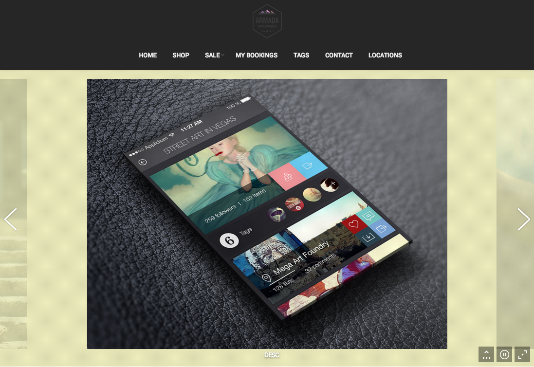
Fig. 4.1. Photo Scroller.
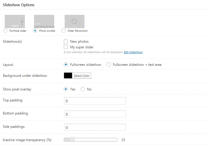
Fig. 4.2. Photo Scroller settings.
Settings for Photo Scroller:
- In the checkbox group called “Slideshow(s)” you can specify which slideshows from corresponding post type will be shown on this page. Note that if you do not select any slideshow, all of them will be displayed on this page.
- Layout: fullscreen slideshow (will hide text area) or fullscreen slideshow + text area.
- Background behind the slider (fig. 4.3).
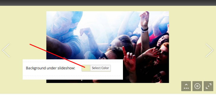
Fig. 4.3. Slideshow background colour.
- Show/hide pixel overlay. Pixel overlay is handy if you are uploading images with relatively low resolution – it will mask upscaling artifacts (fig. 4.4):
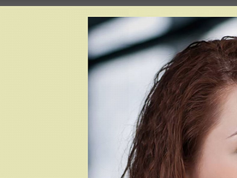
Fig. 4.4. Pixel (dotted) overlay.
- Top padding.
- Bottom padding.
- Side paddings (paddings between slides).
- Inactive slides opacity (fig. 4.5):
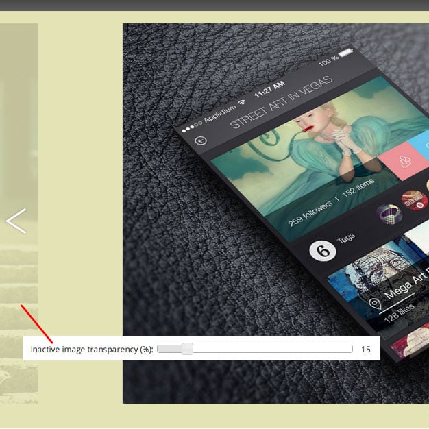
Fig. 4.5. Inactive image transparency.
- Thumbnail stripe. You can hide/show it by default or disable it altogether (fig. 4.6):
Fig. 4.6. Slideshow thumbnails (enabled).
- Thumbnails width and height.
- Specify slider default state: playing or paused.
- Autoplay speed (interval).
- 2 blocks of settings for landscape and portrait images: min and max width, filling mode (fit or fill) for desktops and mobile devices.
Last 2 blocks of settings make this slider very powerful – it allows you to craft a regular slideshow or a scrolling stripe of photos from it.
Fancy Title
Example of a Fancy Title is shown on fig. 1. Basically, it is a page title customized with individual background, color scheme, subtitle and breadcrumbs.
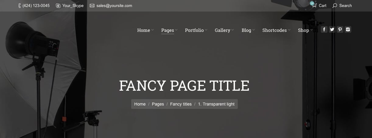
Fig. 1. Fancy title.
Beneath the “Page Header Options”, you’ll find a “Fancy Title Options” box (fig. 2):
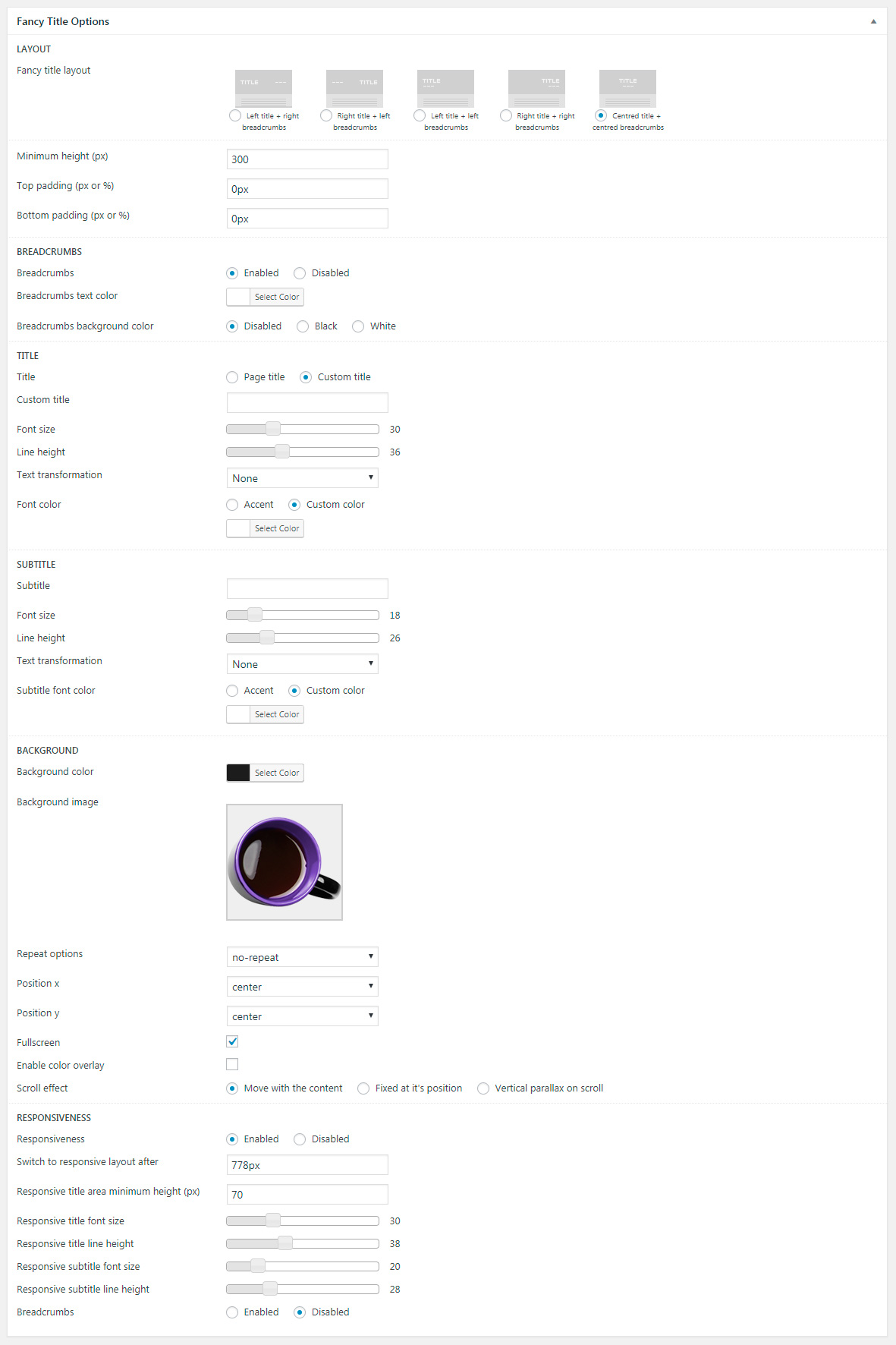
Fig. 2. Fancy Title Options.
There’s whole lotta settings among which:
- fancy title layout (alignment of title + breadcrumbs) height and padding. Note that on practice, “height” setting actually is a “minimal height” value. If it’s not enough to accommodate the title, height will automatically increase to fit it;
- option to show breadcrumbs and adjust their styling;
- title and subtitle settings which allow to use default name of a page or type in custom text title. Apply text transformation and control size and styling;
- various settings for Fancy Title background. Here you can upload background image, set up a parallax background, etc.;
- responsive settings that allow applying different text sizes for different types of devices.