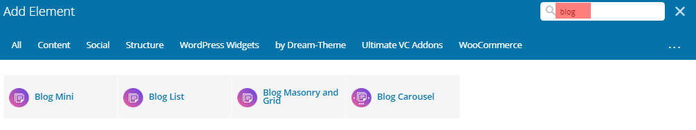
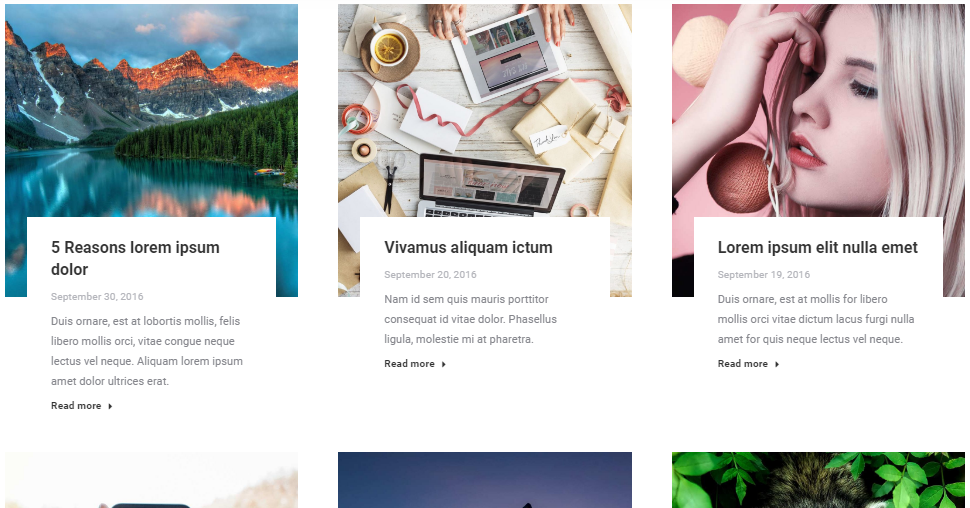
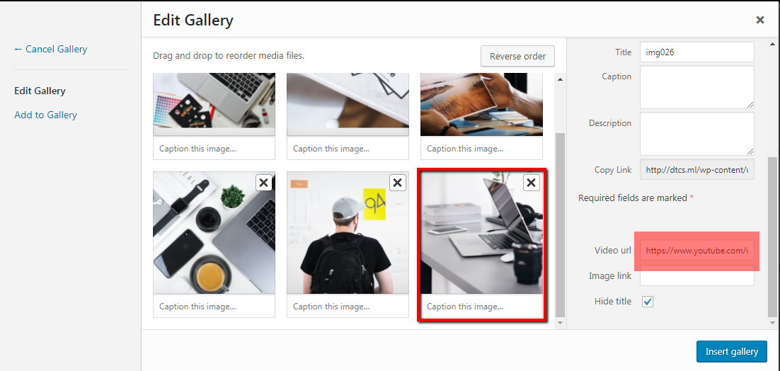
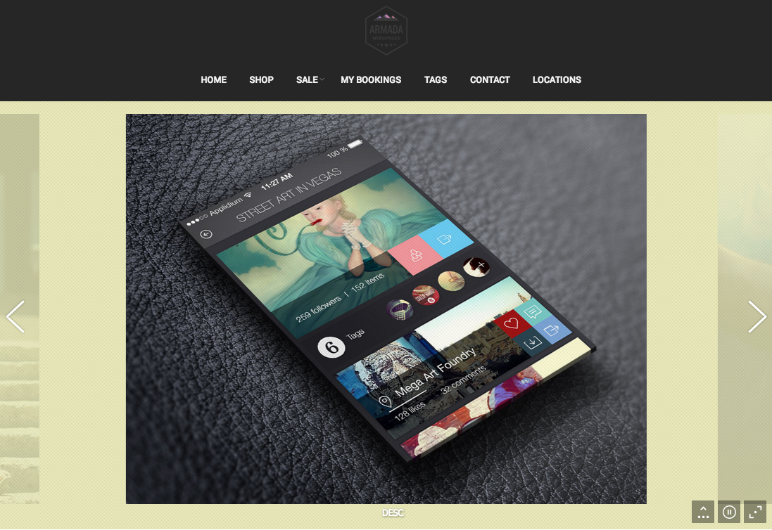
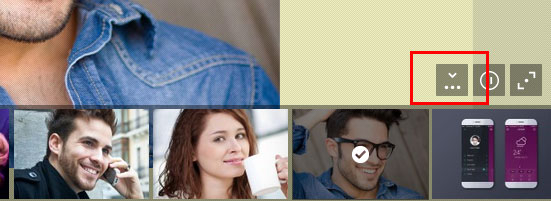
In order to display Portfolio page, you can use our super configurable WPBakery portfolio shortcodes (fig. 1):
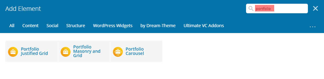
Fig. 1. Portfolio shortcodes.
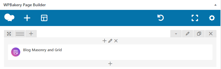
Portfolio Masonry and Grid
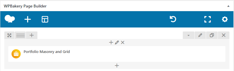
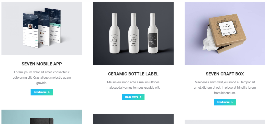
Fig. 2.1. Portfolio Masonry & Grid shortcode.
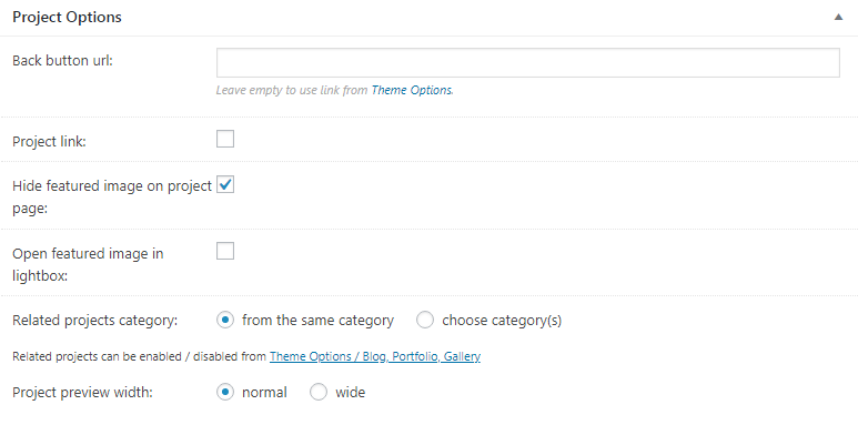
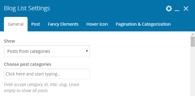
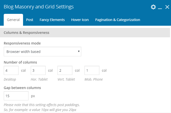
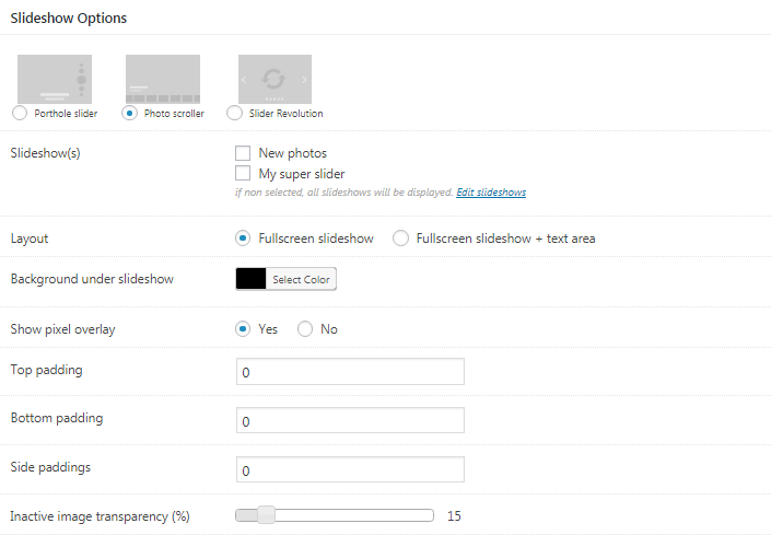
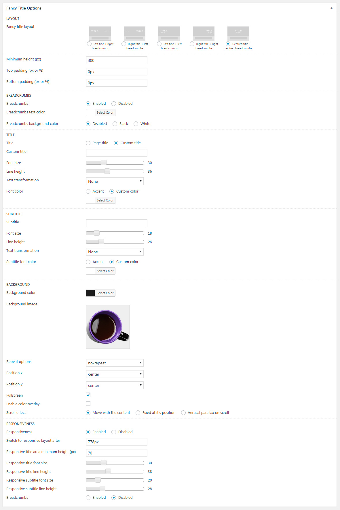
First “General” box in shortcode settings offers to select which posts to display (fig. 2.2).
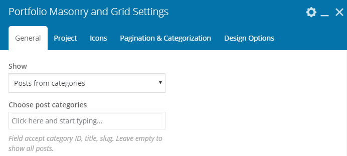
Fig. 2.2. General portfolio settings.
You can select posts basing on their category or display all posts. Other settings from this tab allow to configure posts feed:
- Masonry or Grid mode;
- loading effect;
- layout (classic, bottom overlap, side overlap);
-
content alignment;
- image size, padding, animation, hover;
- dividers;
- background color and padding;
- columns settings, where you can specify number of columns depending on device and browser width;
- responsiveness (decide when to switch to a single-column layout).
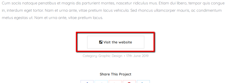
“Project” tab allows to specify what link should be opened when a visitor clicks on a single project on portfolio page: project itself or a URL from its “external link” setting. The rest of options defines appearance of portfolio single post on portfolio page:
- post title font, color, size;
- meta information (whether to display post date, category, etc.) and its look;
- text or, in another words, post content – its amount and appearance;
- “Read more” button label and link/button mode.
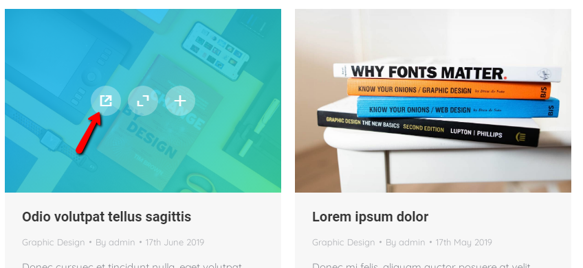
In “Icons” tab, you can:
- decide whether to display “External link”, “Zoom” and “Link to project page” icons on featured image hover;
- select a specific icon;
- configure its size, color, background and border.
It is possible to enable different modes of pagination and adjust the number of project to display in “Pagination & Categorization” tab. You can also configure category filter here: descending/ascending order, name/date ordering and look of filter buttons.
Portfolio Justified Grid
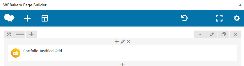
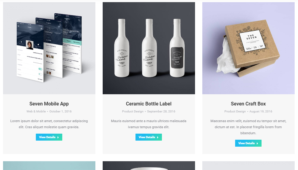
Fig. 3.1. Portfolio Justified Grid.
This shortcode has less settings than the “Masonry & Grid”. In “General” tab you can:
- select categories to display (fig. 3.2);
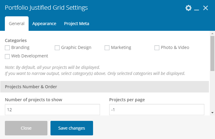
Fig. 3.2. General Portfolio Grid settings.
- specify how many posts should be displayed;
- enable categories filter.
“Appearance” tab allows to specify:
- loading animation effect;
- row target height and gaps between images;
- featured images proportions;
- hide last row if there’s not enough images to fill it (in such a situation, projects get stretched in this row. If such an effect does not suit you, this row can be hidden).
You can also decide here:
- how to display projects descriptions: on colored background, on dark gradient, in the bottom or with help of background and animated lines;
- what animation effect to apply;
- select image hover background color;
- apply content alignment;
- switch on/off projects titles, excerpts, details / link / zoom icons.
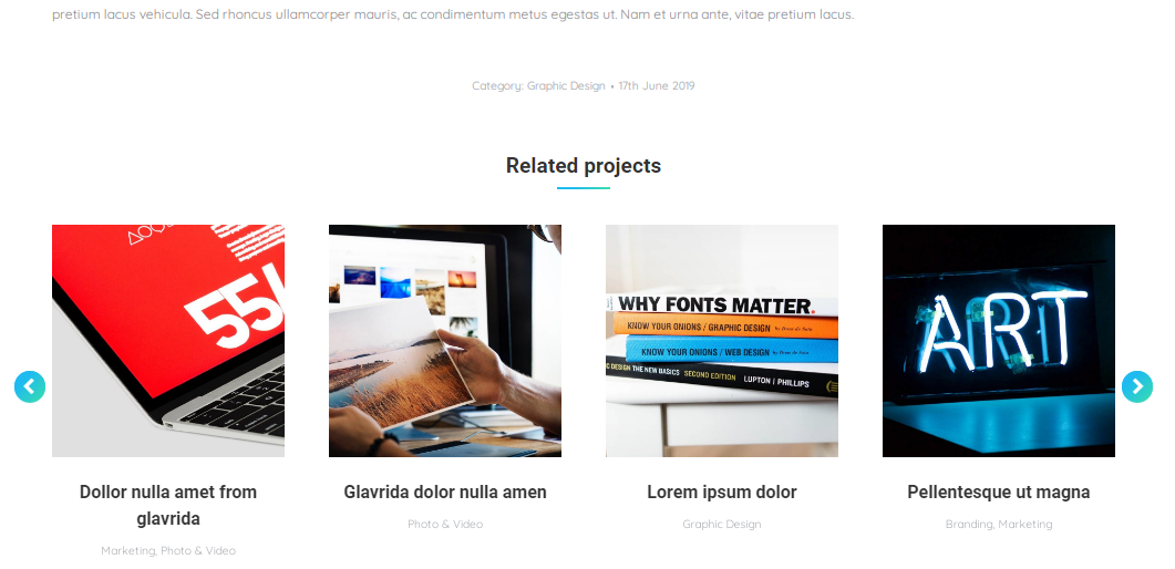
Finally, you can decide whether to display project meta (date, category, author, comments) with help of “Project Meta” tab.
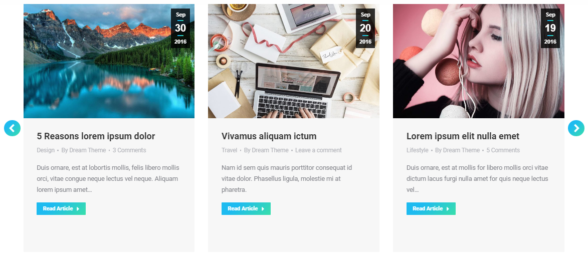
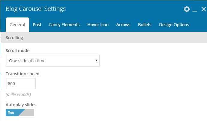
Portfolio Carousel
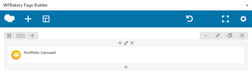
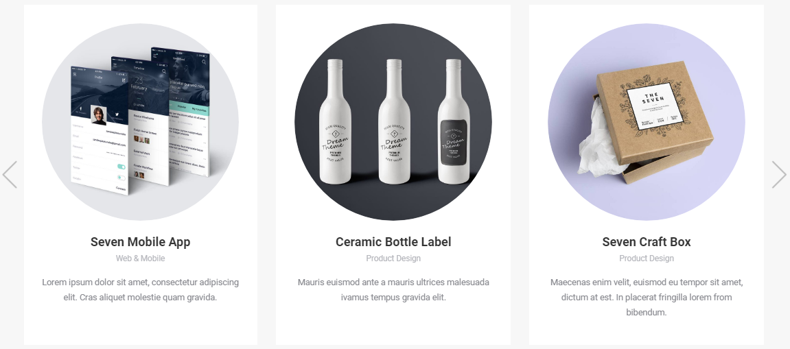
Fig. 4.1. Portfolio Carousel.
Portfolio Carousel has almost the same settings as Portfolio Masonry & Grid, except options for scroll: whether to scroll one slide at time or all visible slides. Plus, settings for arrows (fig. 4.2) and bullets:
- disable/enable;
- select icon, its color, background and position.
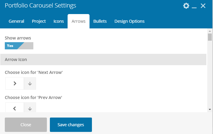
Fig. 4.2. Arrows settings.
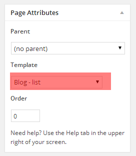
Page Templates
In addition to WPBakery Portfolio elements, you can also use “Portfolio – list”, “Portfolio – masonry & grid” or “Portfolio – justified grid” templates (fig. 5). But please consider, they have less settings than the shortcodes described above.

Fig. 5. Portfolio page template.