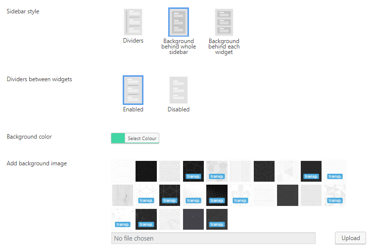
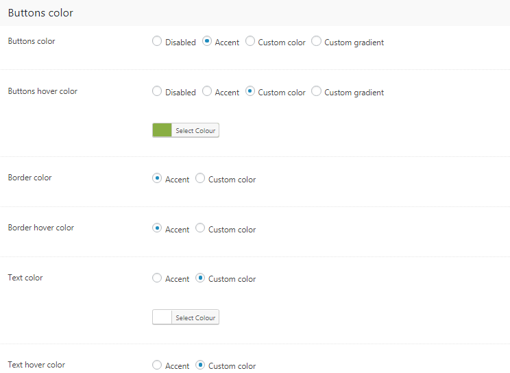
Layout
There are seven header layouts available in The7 (fig. 1):
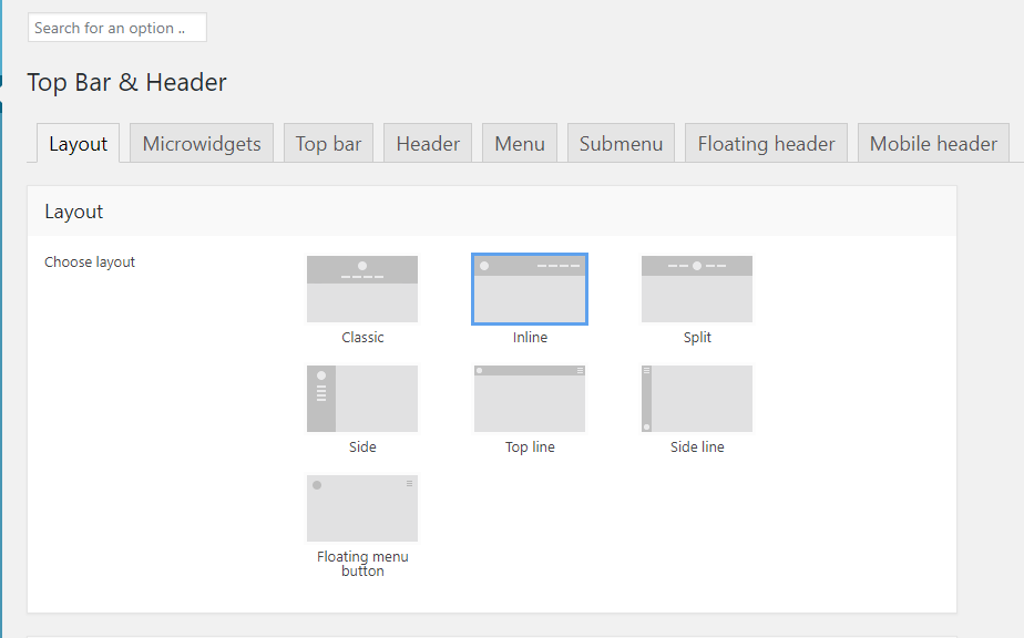
Fig. 1. Header layouts.
You can find some examples below (fig. 2.1 – 2.3):
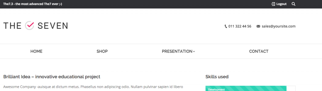
Fig. 2.1. Classic header.
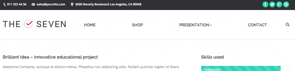
Fig. 2.2. Inline header.
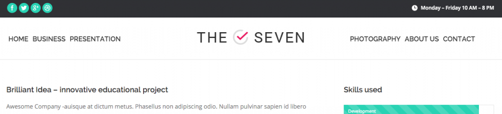
Fig. 2.3. Split header.
Header layout affects number and position of areas where you can place microwidgets (top bar right, top bar left, etc.).
You can also fine-tune elements alignment in this tab (fig. 2.4):
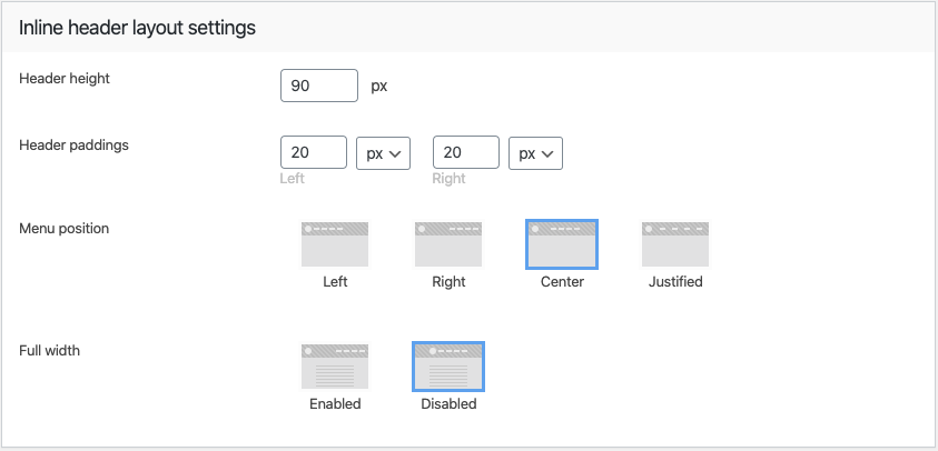
Fig. 2.4. Header paddings and alignment.
You can enable so called Microwidgets (icons like “Cart”, “Working hours”, “Search”, etc.) and drag and drop them to the topbar and other available location based on the header layout you have selected (fig. 3.1):
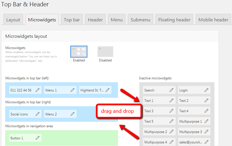
Fig. 3.1. Microwidgets.
To edit Microwidget content just click on the “pencil” icon (fig. 3.1). When editing a specific micro widget, you can configure the visibility of a widget for different devices, assign an icon, select colors, etc. (fig. 3.2):
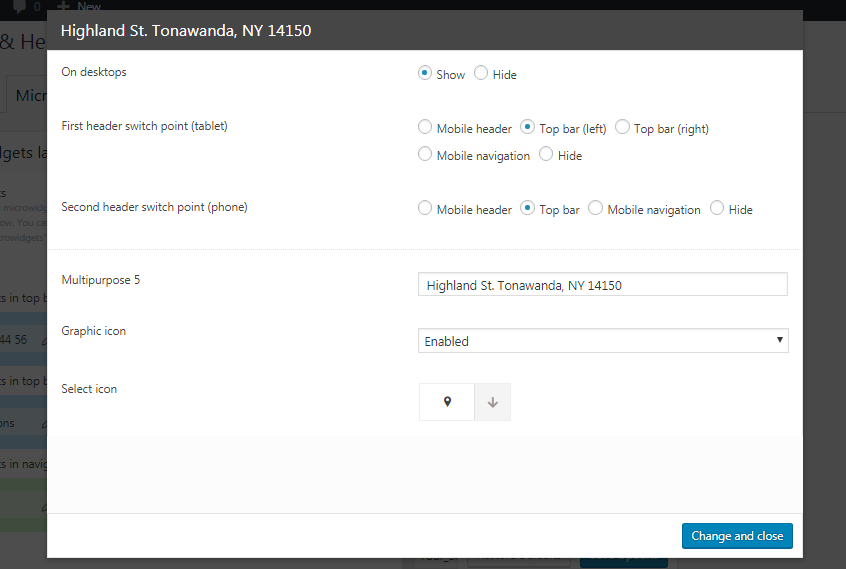
Fig. 3.2. Edit microwidget
The following Microwidget elements are available:
- nine “Multipurpose” widgets with text and icons (for example, address, phone, email);
- five text areas;
- two buttons;
- two menus;
- login;
- social icons;
- search;
- cart (when WooCommerce plugin is activated);
- language switcher (if WPML plugin is active).
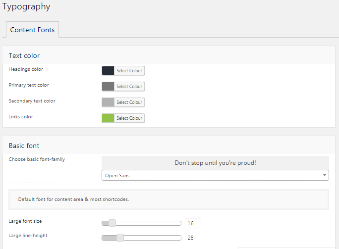
You can specify font family, size and color for specific microwidget area (fig. 3.3):
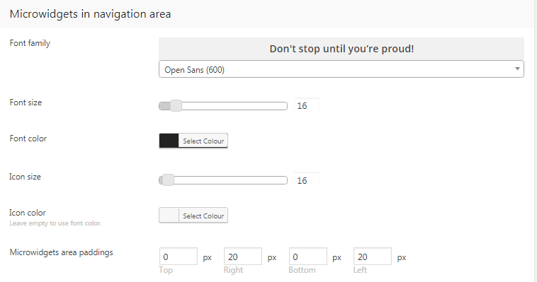
Fig. 3.3. Configure appearance of microwidgets.
Top Bar
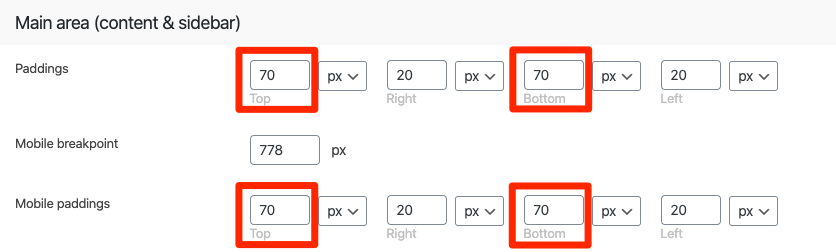
In the Top Bar tab (fig. 4), you can specify:
- height and paddings;
- background colour or image;
- background style: content-width line, full-width line, disabled.
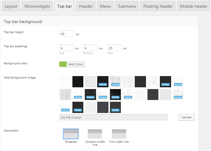
Fig. 4. Top bar settings.
Header
It is possible to specify the following settings in Header tab (fig. 5):
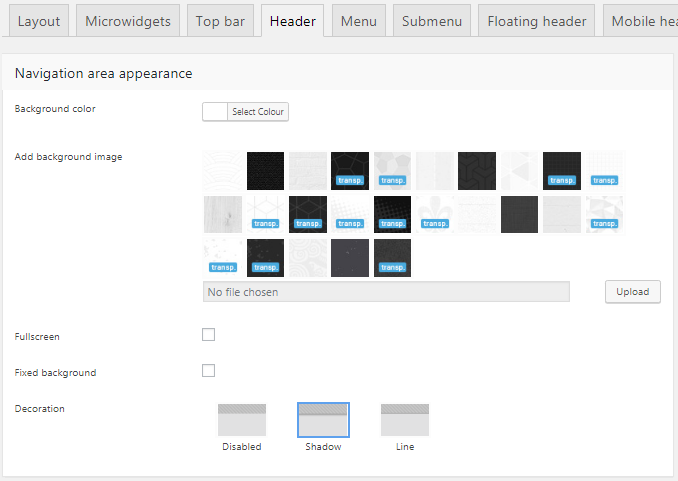
Fig. 5. Header settings.
- background color or image;
- header decoration (shadow, line);
- menu background for “Classic” header and other layout-related settings.
Menu
It is possible to specify the following settings in Menu tab (fig. 6.1):
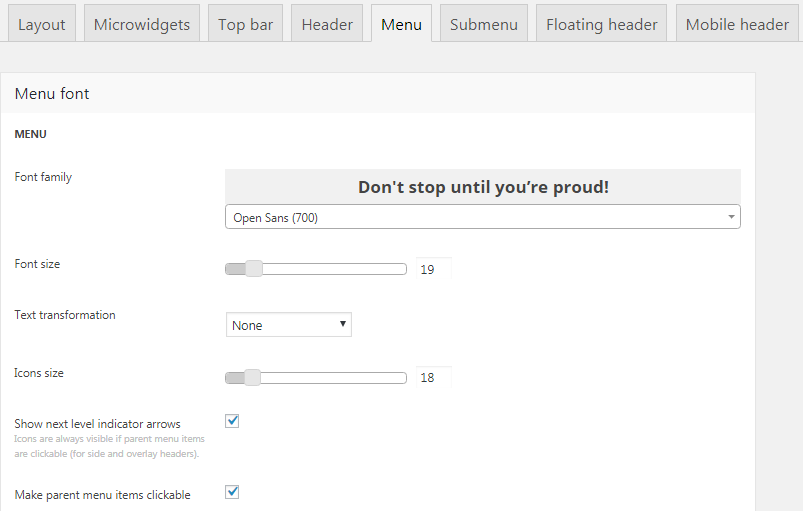
Fig. 6.1. Menu settings.
- main menu font family, font size, colors;
- hover and active menu items style;
- enable/disable next level indicator icons;
- specify menu items margins & paddings;
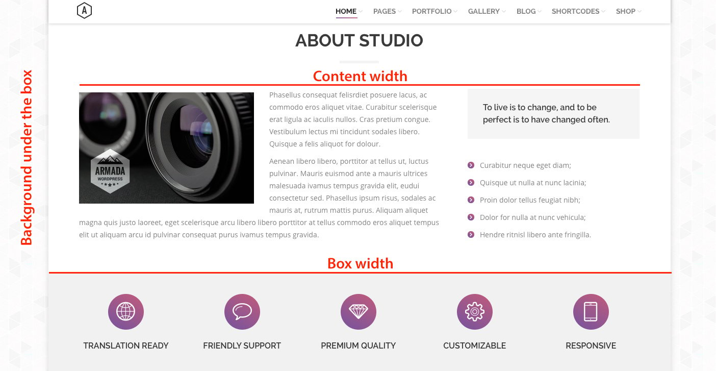
- enable (fig. 6.2) or disable (fig. 6.3) full height & full width links:
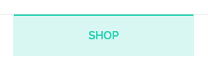
Fig. 6.2. Enabled full-width links.
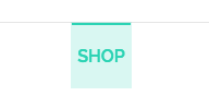
Fig. 6.3. Disabled full-width links.
- enable or disable dividers between menu items;
- decoration styles for horizontal headers (color outline or background for hovers, animation, border radius, etc.).
Submenu
It is possible to specify the following settings in Submenu tab (fig. 7):
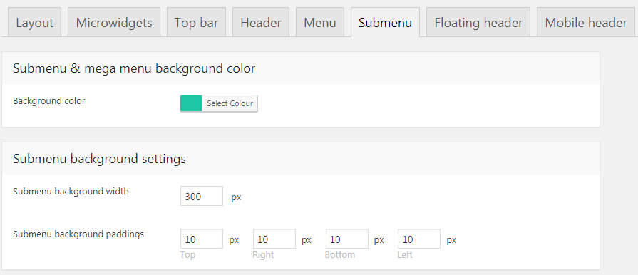
Fig. 7. Submenu settings.
- dropdown menu background color;
- dropdown menu width and padding;
- menu items font family, size, color;
- hover and active menu items style;
- specify menu items margins & paddings;
- select sideways or downwards layout if you use side navigation.
Floating header
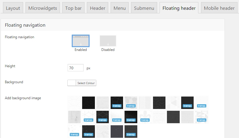
Fig. 8. Floating header settings.
In the Floating header tab (fig. 8), you can specify:
- if this header should be enabled;
- floating header height, color and decoration (shadow, line, disabled);
- effect: Fade on scroll, Slide on scroll, Sticky;
- font colors for idle, hover and active states;
It is also possible to enable Floating top bar (include the topbar in the floating header) there.
Mobile header
This tab allows you to specify:
- first header switch point (for tablets) and second header switch point (for phones);
- header height and layout for tablets and phones (fig. 9.1):
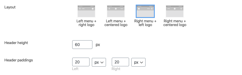
Fig. 9.1. Mobile header layouts.
- mobile header background color, icons size and colors;
- enable or disable floating mobile navigation;
- specify font family, size and colors (including hover/active menu items);
- color of website overlay when mobile menu is open;
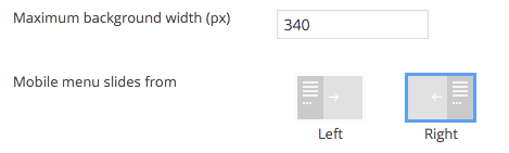
- mobile menu background and alignment (fig. 9.2):
- “Open” button design (fig. 9.3): icon, position, paddings/margins, border, color.
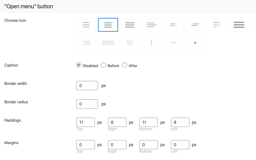
Fig. 9.3. “Open” button design.
Mobile menu
It is possible to specify the following settings in Mobile Menu tab:
- mobile menu items font family, size, color;
- menu dividers;
- menu width, paddings, background color, left/right position;
- site overlay (on mobile menu opening) colors;
- “Close” button design (fig. 10.1): icon, position, paddings/margins, border, color.
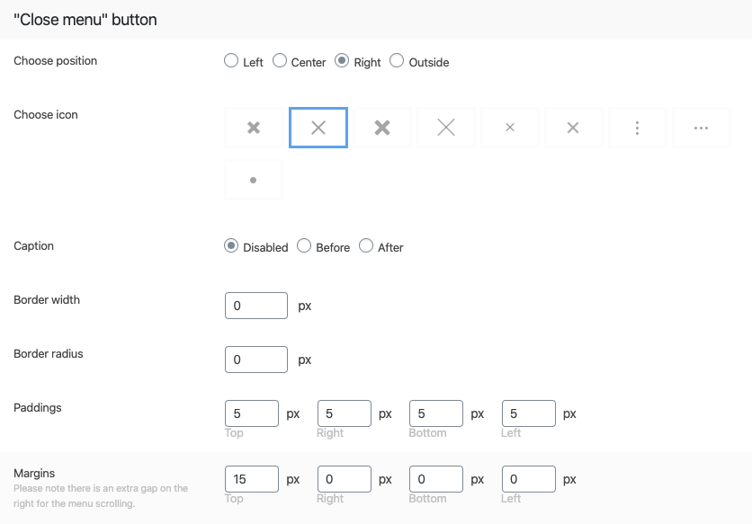
Fig. 10.1. “Close” button design.