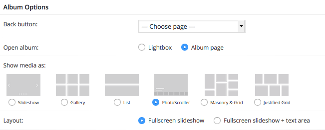
The7 typography shortcodes are available in a standard WYSIWYG editor and, in result, in WPBakery Page Builder “Text Block”.
Before getting started, please make sure that you’re accustomed with idea of shortcodes in WordPress: https://en.support.wordpress.com/shortcodes/
Note that link above is given only for the quick illustration of what shortcodes are. Not all shortcodes described in it will work in your theme.
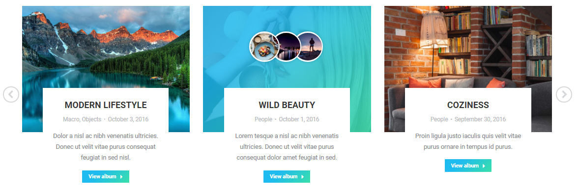
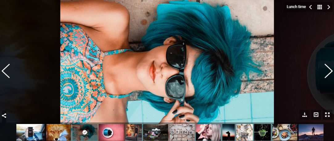
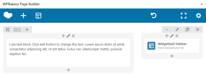
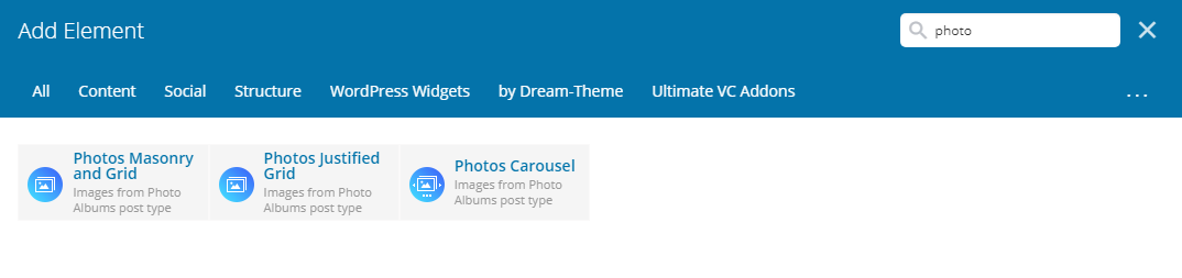
Apart from visual elements/shortcodes in WPBakery Page Builder in The7 we are also utilizing conventional text-based shortcodes which are listed in a dropdown when clicking on “Shortcodes” in your WYSIWYG Editor or Text Block (fig. 1).
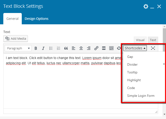
Fig. 1. Text shortcodes by Dream-Theme.
Gap
[dt_gap height=”10″ /]
Gap shortcode works the same as “Empty Space” elements – it adds a gap between paragraphs and other elements. It has the only option – height, where “10” stands for 10px.
Divider
[dt_divider style=”thin” /]
Divider shortcode inserts a horizontal divider line between elements. It can be thin or thick, depending on what you specify under “style” option.
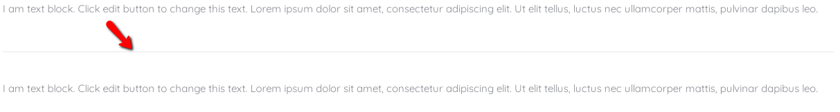
Fig. 2. Divider.
Tooltip

Fig. 3. Tooltip.
In order to achieve such a nice layout (fig. 3) try using the following shortcode syntax:
Apply [dt_tooltip title=”tooltip”]popup content[/dt_tooltip] shortcode here.
Highlight
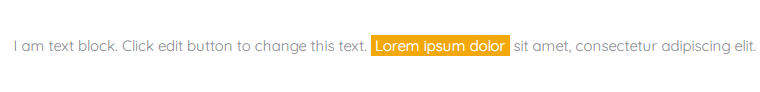
Fig. 4. Highlight shortcode.
This shortcode hightlights a part of a text string. Use the following syntax:
Ut elit tellus, [dt_highlight color=”yellow” text_color=”” bg_color=””]lorem ipsum dolor[/dt_highlight] sit amet.
Shortcode attributes are listed below:
- use color=”” attribute to specify one of color presets: white, red, berry, orange, yellow, pink, green, dark_green, blue, dark_blue, violet, black, gray, grey. Background color will be altered appropriately . And text color will automatically turn white;
- alternatively, use combination text_color=”” bg_color=”” in order to specify both text and background colors. Use HEX values like “#cc3366”;
- or leave all attributes empty in order to apply accent color to the background (including the case when accent color is gradient) and make text color white.
Code
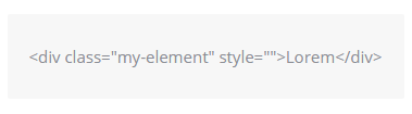
Fig. 5. Code shortcode.
This shortcode allows to display code strings with correct interpretation of symbols “, <, >, etc. (unlikely to the case when these characters are inserted directly into WYSWYG editor). Use the following syntax:
[dt_code]<div class=”my-element” style=””>Lorem</div>[/dt_code]
Simple Login Form
You may want to display login form in your website front-end (fig. 6). Simple Login Form shortcode will help you in this case. Use the following syntax:
[dt_simple_login_form label_username=”” label_password=”” label_remember=”” label_log_in=””]
It has four attributes to adjust standard labels for username and password fields, “Rememeber me” check-box and “Log in” button. Like:
[dt_simple_login_form label_username=”Nom d’utilisateur” label_password=”Mot de passe” label_remember=”Se souvenir de moi” label_log_in=”Se connecter”]
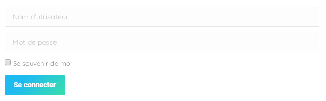
Fig. 6. Simple Login Form shortcode.
Leave them empty if you want to use default WordPress labels.


