If you are building a website from scratch, we suggest you to apply the following Elementor builder settings (fig. 1):
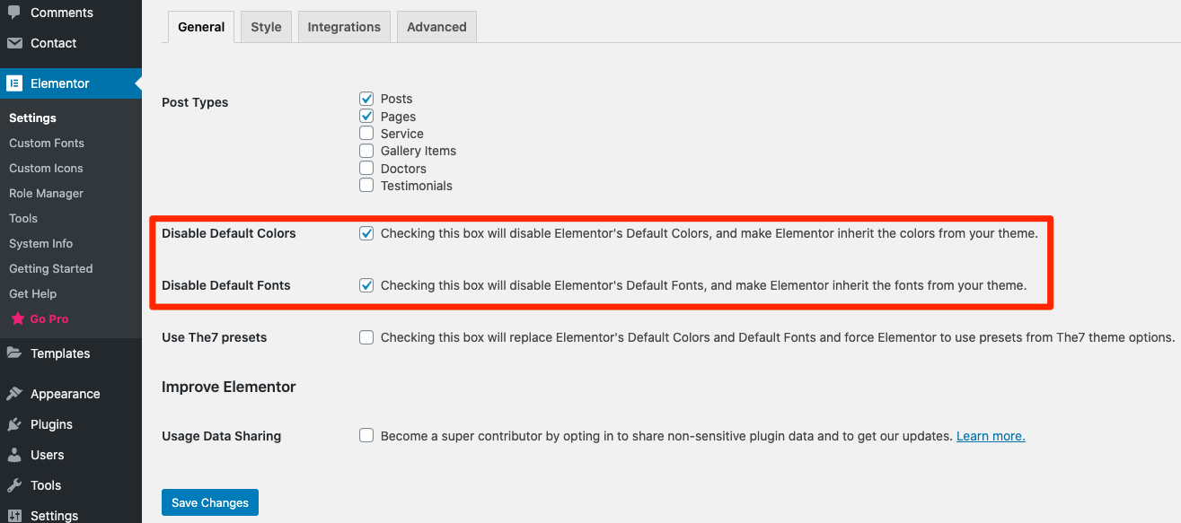
Fig. 1. Advised Elementor settings.
Such configuration disables native Elementor’s stylesheets for widgets design and applies The7 styles only. You can also choose “Use The7 presets” option, which keeps Elementor’s CSS files, but rewrites its colors and fonts with the ones from The7 theme options.
You may also want to make desktop/mobile Elementor switch points (fig. 2) equal to appropriate values in The7 Theme Options -> Topbar & Header -> Mobile header, etc. But this is not a must – you can leave default values, as well as apply any other values in accordance with needs of your website design.
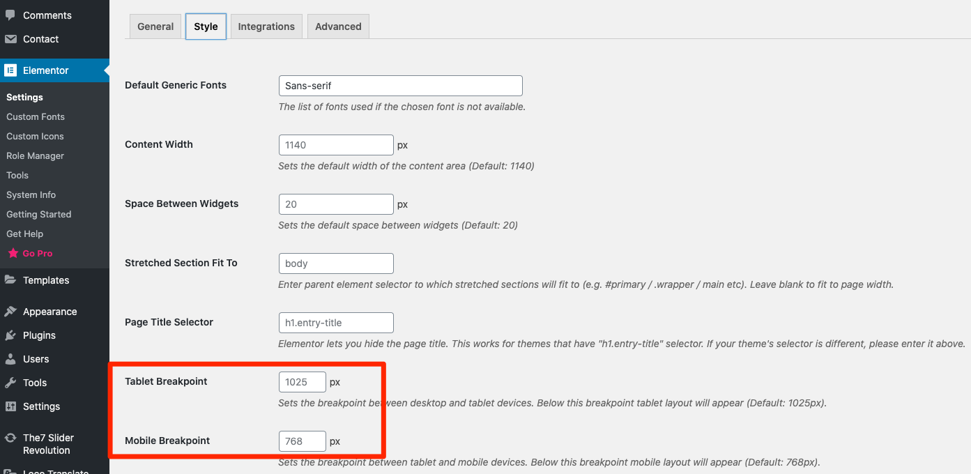
Fig. 2. Elementor Switch Points.
If some changes don’t get applied, please refer to Elementor -> Tools -> General -> Regenerate CSS.
If you are using pre-made demo web-site, appropriate settings are imported automatically. And you can skip this step.